Hearst UK Design Brief: Runner's World 2022 Accreditation Logos
[Graphic Design]
Hearst UK Design Brief: Runner's World 2022 Accreditation Logos
Medium: Adobe Illustrator, After Effects // Role: Designer
The Brief: Redesign Runner’s World accreditation logos for the year 2022. All logos must resonate with clients and consumers as well as stand out within the endorsement market.


Logos needed to be scalable according to different marketing channels (e.g. the logo must be able to be used on pack, in-store, on digital and social platforms etc.) All logos must be in keeping with the Hearst brand and align with the look and feel of that brand.
design process and outcomes:
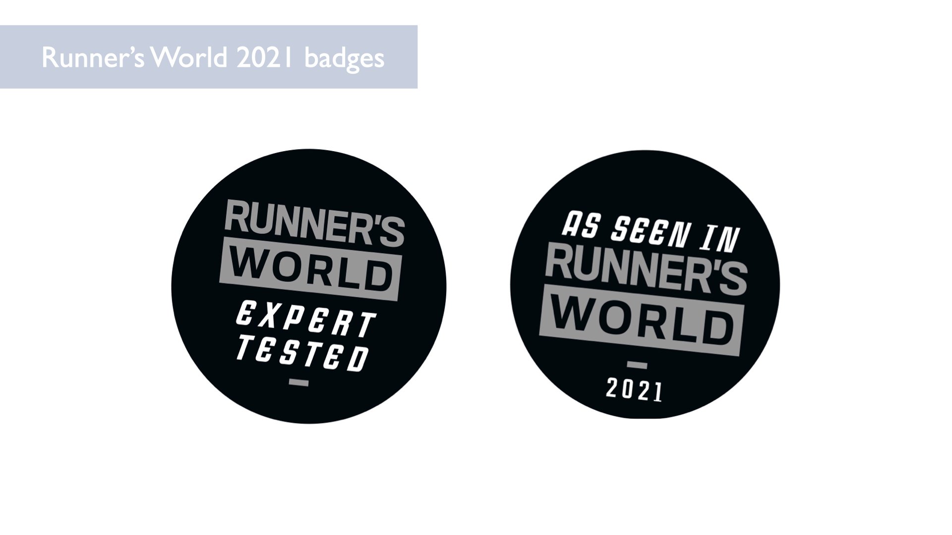
I wanted to created something that conveyed energy and movement more effectively than the badges used in 2021.
In my exploration of the brand and reading of its content, I came up with a list of words and reactions:
There’s a lot of positivity and a feeling of “cheering on”
It is bright and draws you in with sharp imagery and bright colors
The content and images are inspiring — there’s a sense of hopefulness and energy
There’s an obvious physicality to the content which is energizing to consume and look at
There’s a diverseness — this isn’t a platform for only olympic runners or track stars, this is for anyone with any body type, age or identity who has running as a practice in their life
As is implied, there as a strong human emphasis to this content, the overarching ethos really seems to be about this welcoming global community you become a part of as a runner — which is reflective in the name “Runner’s World”
Visual observations of the brand:
Clear color theme (turquoise and blue, bright yellow, black)
Feeling of “movement” with some of the shapes and styles (such as italicized text, slanted lines, action imagery)
There’s a high contrast to a lot of the content which gives it a strong energy and vitality


I have been a runner most of my life, purely for enjoyment. I don’t set goals and I don’t really do races, but for me, running is such a good way to feel connected to the outdoors, feel healthy and even explore new places. I like to use running as a way to explore new places, whether when traveling or even in the city where I live. I use a tracking app which saves the map view of my runs and for years I love looking back at the overall view of the squiggly shapes that my directionless runs make. When thinking about how I was going to manifest the spirit of running in this badge, I started thinking: What is the “shape” of running? I thought about how lines can tell a runner’s story — a marathon route, trail lines they followed, marks on a track, or as in my case, the tracked runs in my app. In my design process, I started by drawing tons of shapes inspired by “running lines”.

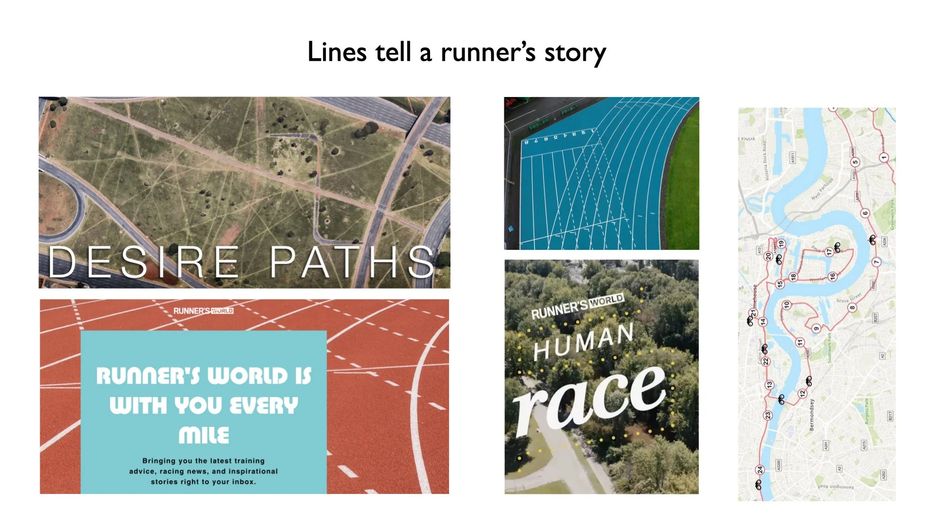


Here are some of the iterations of the badges that emerged during my process of designing. I wanted to capture different types of lines in these badges to capture the spirit of running and give the sense of movement and energy using colors familiar to the brand.
Concept 1:
I decided to make the “as seen in Runner’s World” badge representative of the many lines and directions and shapes that running can take, especially for people who run for hobby. For the “Expert Tested” badge I opted for a sharper more symmetrical set of lines to imply precision and expertise.
For concept 1, I also wanted to explore giving the lines movement for use on digital surfaces to really make them stand out. In my research I observed that most of the uses for these badges seemed to be digital, and I felt that having a more dynamic element would give them an edge, particularly for use on social media.

Concept 1: I decided to make the “as seen in Runner’s World” badge representative of the many lines and directions and shapes that running can take, especially for people who run for hobby. For the “Expert Tested” badge I opted for a sharper more symmetrical set of lines to imply precision and expertise.
For concept 1, I also wanted to explore giving the lines movement for use on digital surfaces to really make them stand out. In my research I observed that most of the uses for these badges seemed to be digital, and I felt that having a more dynamic element would give them an edge, particularly for use on social media.

Concept 2: The second concept is a bit more uniform with an emphasis on color. With these, I used symmetrical lines pointing upward to give a sense of movement and aspiration, and paired gradients to give it high energy and a bit of a 3-dimensional feel.


