[Graphic Design]
Hearst UK Design Brief: Digital Spy 2022 Accreditation Logos
Medium: Adobe Illustrator // Role: Designer
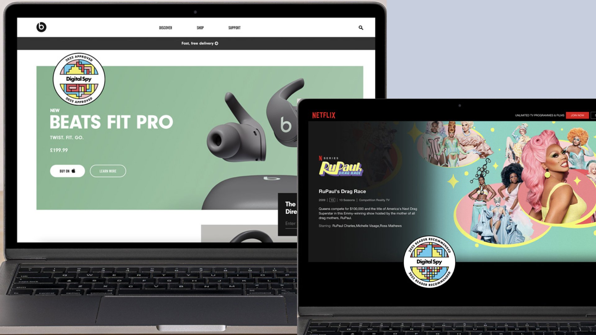
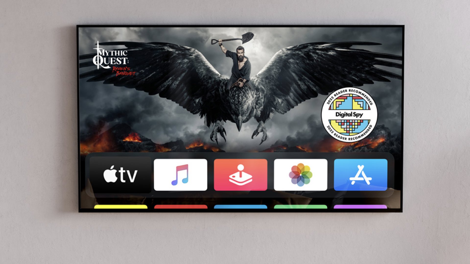
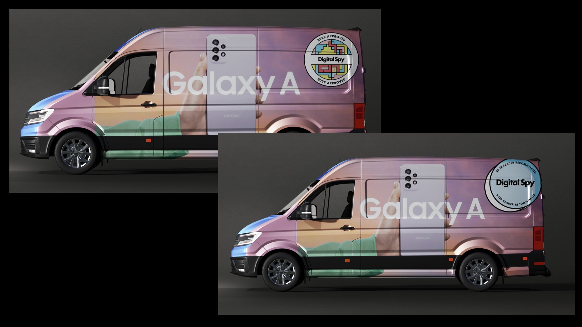
The brief: Redesign Digital Spy accreditation logos for the year 2022. All logos must resonate with clients and consumers as well as stand out within the endorsement market.
Logos must be scalable according to different marketing channels (e.g. the logo must be able to be used on pack, in-store, on digital and social platforms etc.) All logos must be in keeping with the Hearst brand and align with the look and feel of that brand.
design process and outcomes:
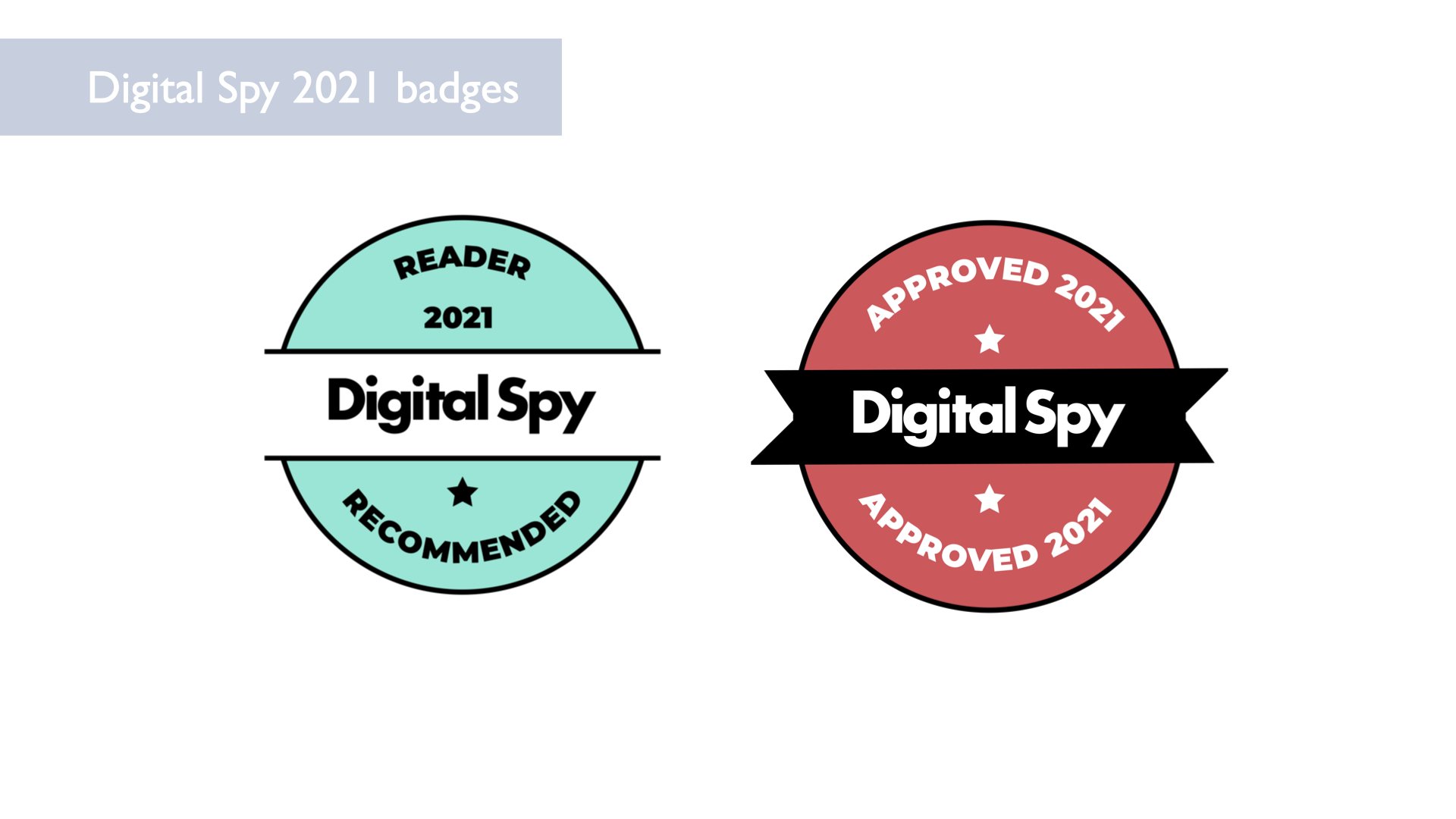
I wanted to create logos that were more contemporary and complementary to one another than the logos used in 2021.
In my exploration of the Digital Spy brand, I started again by coming up with a list of words that came to mind to help steer my creativity:
The large variety of image heavy content feels very exiting — when you go to the website or social media pages there’s a lot to Cath your interest
There’s a sense of that Hollywood TV drama that we all know and love — feels like the same satisfaction you get when you open your Netflix homepage
There’s a lot of bold imagery and stills from TV shows and movies that spark interest
The brand feels modern and fresh and fun
There’s a sense of action and color
Visual observations of the brand:
Clear color theme
Another important observation is that since Digital Spy usually places its graphic elements on top of very colorful, action-packed imagery, or just alongside it
It’s important that graphic elements and text contrast that real-life imagery so that it stands out on the surface and doesn’t compete
My inspiration for designing the new badges combined characteristics from my observations of the brand as well as trends and themes I felt could help make it even more exciting.
Color-blocking
geometric shapes
imagery backgrounds
all reminiscent of a sort of 90s nostalgia
Here are some of the iterations of the badges that emerged during my process of designing. I wanted to use high contrast and geometrics to align with tech culture and some of the 80s/90s graphic trends I’ve been seeing in pop culture recently.
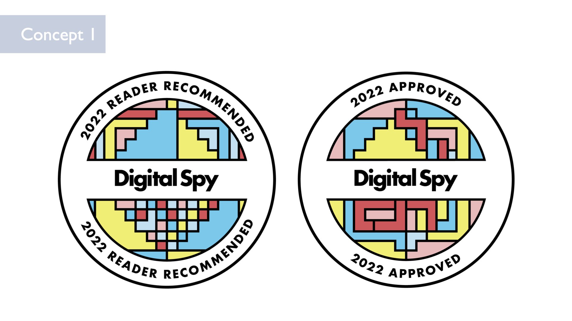
Concept 1:
I decided to make the “as seen in Runner’s World” badge representative of the many lines and directions and shapes that running can take, especially for people who run for hobby. For the “Expert Tested” badge I opted for a sharper more symmetrical set of lines to imply precision and expertise.
For concept 1, I also wanted to explore giving the lines movement for use on digital surfaces to really make them stand out. In my research I observed that most of the uses for these badges seemed to be digital, and I felt that having a more dynamic element would give them an edge, particularly for use on social media.
Concept 1: These designs combine a 90s-retro look with a more sleek and modern feel that’s characteristic of the Digital Spy brand. There’s a nod to pixel art and tech-culture with these shapes that I think fits well with the brand and accreditation purpose.
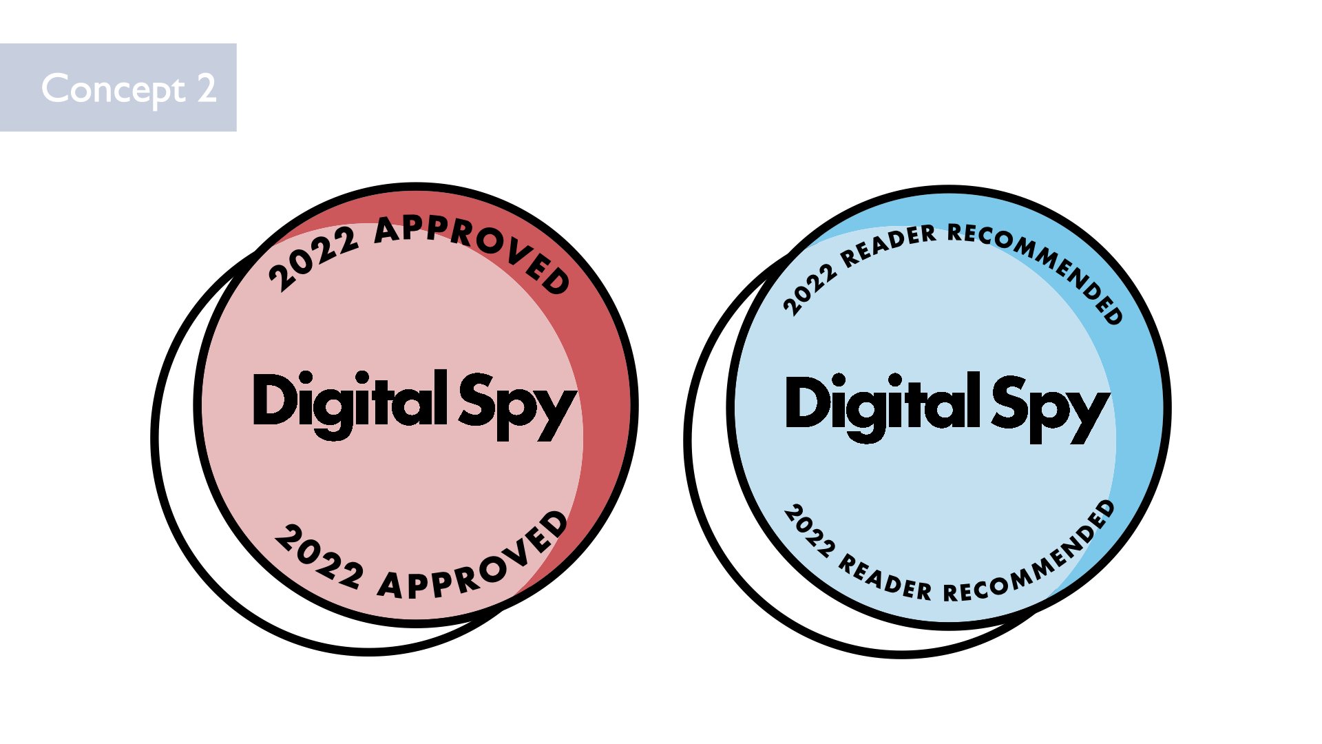
Concept 2: These designs are meant to be more sleek and minimal, allowing them to “pop” on screen in a different way.
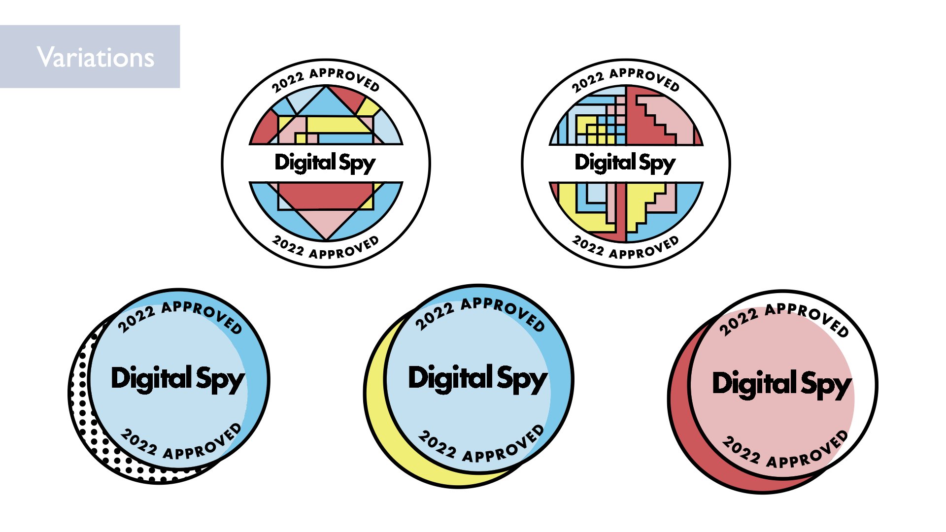
For both concepts, I included multiple variations in colors and patterns. When it’s being used on a client’s website and packaging, they can have the added bonus choosing a variation that worked best with their content. By providing these different subtle variations, Digital Spy doesn’t lose its visual identity, but the client gets to feel involved and empowered by having options to choose from (mutually beneficial).


